Choosing the right color palette for each room in your home can transform your living space and reflect your personal style. The art of selecting hues goes beyond mere aesthetics; it involves understanding the emotional and psychological impact colors have on us. Whether you're looking to create a calming retreat or a vibrant gathering space, mastering color selection can enhance the ambiance and functionality of every room.
Understanding Color Psychology
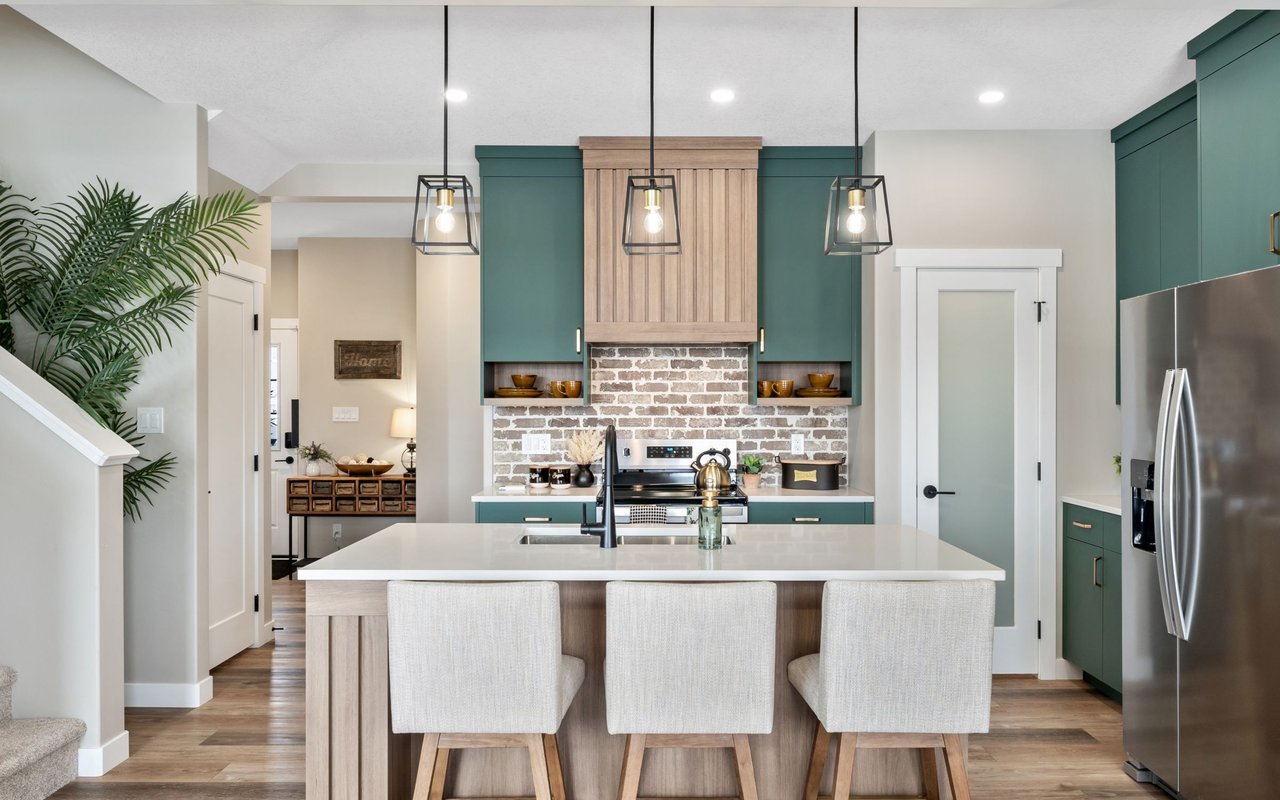
Color psychology plays a crucial role in how we perceive and interact with spaces. Different colors evoke different emotions and can influence mood and behavior. For instance, blues and greens are often associated with tranquility and relaxation, making them ideal for bedrooms and bathrooms. On the other hand, warm colors like reds and oranges can stimulate energy and conversation, making them suitable for social areas like living rooms and dining rooms. Understanding these associations can guide you in choosing colors that align with the purpose of each room.
Assessing Natural Light
Natural light significantly affects how colors appear in a room. Rooms with ample sunlight can handle darker or more saturated colors, as the light will keep the space from feeling too enclosed. Conversely, rooms with limited natural light might benefit from lighter shades that reflect light and create a sense of openness. When selecting colors, consider the direction the room faces and how the light changes throughout the day. Testing paint samples on different walls and observing them at various times can help you make an informed decision.
Considering Room Size and Function
The size and function of a room should influence your color choices. Lighter colors can make small rooms feel larger and more open, while darker hues can add coziness to expansive spaces. Additionally, consider the room's purpose when selecting colors. A home office might benefit from colors that promote focus and productivity, such as soft greens or muted blues. In contrast, a playroom could embrace bold, playful colors that inspire creativity and fun.
Creating a Cohesive Color Scheme
A cohesive color scheme ensures that your home feels harmonious and well-designed. Start by selecting a base color that will be used throughout the home, then choose complementary colors for each room. This approach creates a sense of flow and continuity, even if each room has its own distinct personality. Using a color wheel can help you identify complementary and analogous colors that work well together. Additionally, consider incorporating accent colors through accessories and decor to add depth and interest.
Balancing Bold and Neutral Tones
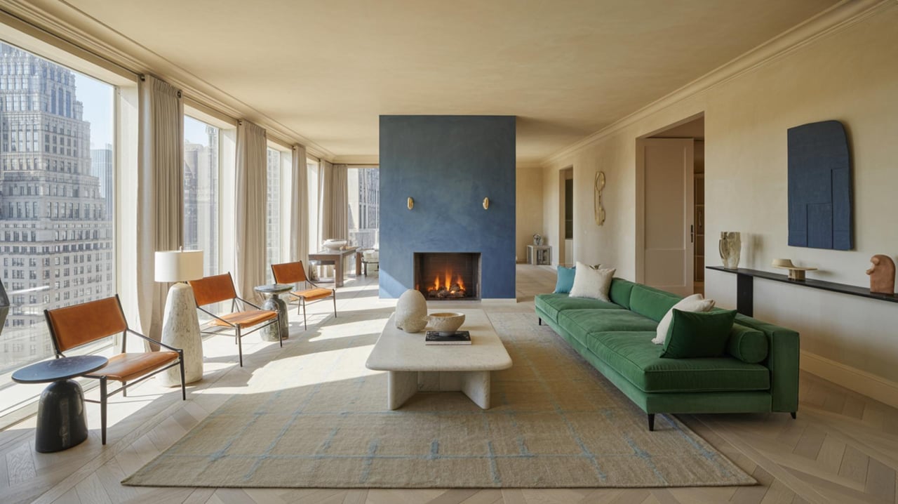
Striking the right balance between bold and neutral tones can create a dynamic and inviting space. Neutral colors, such as whites, grays, and beiges, provide a versatile backdrop that allows bolder hues to stand out. Consider using bold colors as accents on feature walls, furniture, or decor items. This approach allows you to experiment with color without overwhelming the space. Neutrals can also serve as a calming counterbalance to more vibrant shades, ensuring that the overall design remains cohesive.
Incorporating Texture and Pattern
Texture and pattern can enhance your color scheme and add visual interest to a room. Consider how different materials and finishes can complement your chosen colors. For example, a matte finish can create a soft, understated look, while a glossy finish can add vibrancy and reflect light. Patterns, such as stripes or geometric designs, can introduce additional colors and create focal points within a room. When incorporating patterns, ensure they align with your overall color scheme to maintain harmony.
Testing Paint Samples
Before committing to a color, it's essential to test paint samples in the actual room. Paint swatches can look different in varying lighting conditions and against different surfaces. Apply samples to multiple walls and observe how they look throughout the day. This process can prevent costly mistakes and ensure that you're satisfied with the final result. Testing samples also allows you to experiment with different shades and finishes, helping you refine your color choices.
Considering the Emotional Impact
Colors can have a profound emotional impact, influencing how we feel in a space. Consider the mood you want to create in each room and select colors accordingly. For example, soft pastels can create a soothing atmosphere in a nursery, while rich jewel tones can add drama and sophistication to a dining room. Understanding the emotional impact of colors can help you create spaces that resonate with your personal preferences and lifestyle.
Coordinating with Existing Decor
When selecting colors, consider how they will coordinate with your existing decor and furnishings. Take into account the colors of your furniture, artwork, and textiles to ensure a cohesive look. If you have a statement piece, such as a colorful rug or a piece of art, use it as inspiration for your color palette. Coordinating colors with existing decor can create a seamless transition between old and new elements, resulting in a harmonious and well-integrated space.
Seeking Professional Advice
If you're unsure about your color choices or need guidance, consider seeking advice from a professional interior designer. Designers have expertise in color theory and can provide valuable insights into creating a balanced and aesthetically pleasing color scheme. They can also offer suggestions for incorporating trends and personal preferences into your design. Working with a professional can give you confidence in your color selections and ensure that your home reflects your unique style.
Transform Your Space with the Right Colors
Choosing the perfect colors for each room can truly transform your home, making it a reflection of your personality and style. With the right hues, you can create a welcoming and harmonious environment that you and your guests will love. Whether you're looking to refresh a single room or your entire home, expert guidance can make all the difference. For personalized advice and more tips on color selection, visit Marcus Skenderian today.